
Customising Microsoft Entra's Sign-In Page 🖌️
Back in 2023, Microsoft introduced CSS support for the Entra sign in page. Come with us as we dive into that customisation.
Back in 2023, Microsoft gave administrators a really cool way of customising the Entra sign-in page to make it more "on-brand" with your company's design and to help make it look less "Microsoft"...
It's now been two years since the release of this feature, and I've yet to see a large adoption of the custom CSS feature. Admittedly, customisation isn't at the top of everyone's priority list but give me a few minutes and I'll explain why this customisation feature in particular, should be.
Security & Trust
Stay with me here... I know what you're thinking, "how on earth could customising a simple authentication page improve security?". You're right, it doesn't. Until you think about the hundreds of phishing campaigns out there specifically designed to replicate the Microsoft sign in page, used to steal your user's credentials.
This is where customisation and branding comes in.
What if you could make the sign in pages look a lot less like Microsoft's standard, out of the box design. Well, your users signing into your services everyday would become accustomed to the unique branding, look and feel of the sign in page you curated. Making it a lot less likely that they'd enter their work credentials into a sign in page that doesn't look like a legitimate workplace sign in page.
Your sign in pages just became a lot more... trustworthy!
"But Chris... what's to stop someone replicating the sign in page customisations I've created?". Absolutely nothing. But... it's a lot less likely that a malicious actor would attempt to replicate the styling and design of your sign in page, as opposed to Microsoft's. So, odds are... you're winning.
Deep Dive into Customisation
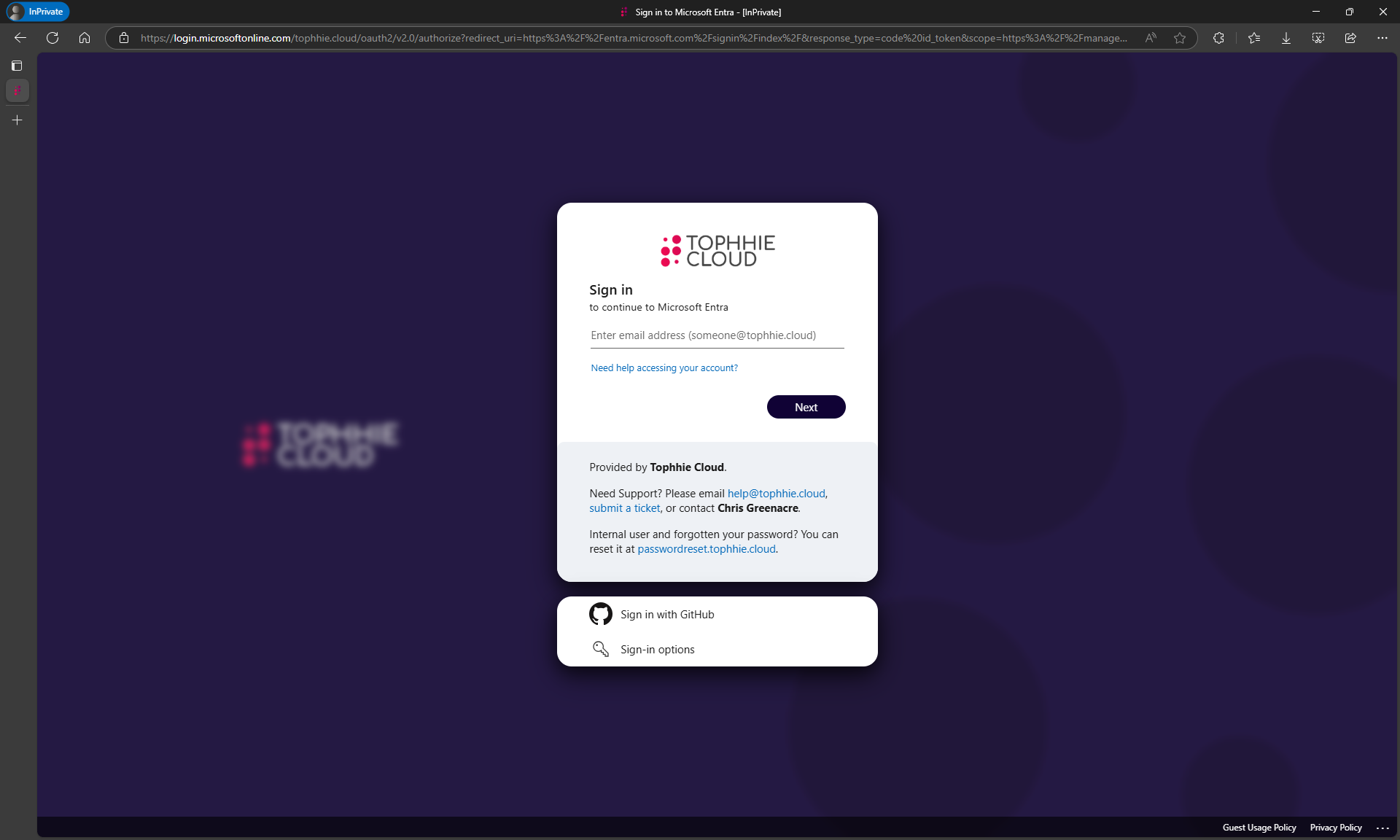
This is my Entra sign in page. You'll notice some subtle (and some not so subtle) differences between mine and Microsoft's standard design.
- The sign in box, and the federation credentials box both have rounded corners.
- There's a very subtle black shadow behind both boxes.
- I've applied a glass effect behind the sign in boxes and in front of the background image.
- The sign in buttons are also rounded, and moved every so slightly down so they align center vertically between "Need help accessing your account" and the start of the boilerplate background colour.
- The colour of the boilerplate text background has been changed to make it stand out every so slightly more.
- The font size of the "Sign in" header has been changed.
- The banner logo has been centered in the sign in box.
Some more changes you won't see in this screenshot, but are definitely there...
- Error messages are now boldened, and are greater in font size.
- Some CSS changes are dependant on whether the mobile sign in page is displayed, or the desktop sign in page.
Microsoft make so many elements available for customisation, including the sign in box, the federation credential box, the background image holder, the background image overlay, the header, the footer, the logos, the titles and subtitles, error messages, buttons... meaning you can make your Entra sign in page truly yours, branded to exactly how your company wants to portray itself.
Creating the Custom CSS File
As of today (25th April 2025), Microsoft have made available a CSS template file you can download here.
Once downloaded and opened, you'll be presented with a long list of different elements you can customise, each element has a comment inside explaining which part of the sign in page that element affects.
For example:
- .ext-banner-logo
- This element styles the company logo displayed inside the sign in box.
- .ext-error
- The element styles any error messages that may appear when a user is signing in.
- .ext-boilerplate-text
- This element styles the custom message text shown underneath the sign in button.
Go wild, throw in as many CSS customisations as you can think of. Be creative, really make that sign in page your own.
To help you get started, I'm going to include the CSS customisation file for the Tophhie Cloud tenant for you to download here. (I know what I said about security and trust, but also, there's not enough examples out there to get started.)
Here's something we found both interesting, and undocumented...
The Microsoft Learn article for "CSS Referencing guide for customizing company branding", shows no indication or support for @media CSS queries. But, in our testing, we found these to work!
Therefore, we've been able to apply certain CSS properties dependant on whether the mobile sign in page is shown, or the desktop sign in page.
To make customisations to the mobile sign in page only, add this to the bottom of your CSS file.

@media (max-width: 600px) {

}

To make customistaions to the desktop sign in page only, add this.

@media (min-width: 601px) {

}
Remember to add the individual .ext elements you want customising for each version of the sign in page, into their respective @media queries.
Applying the Custom CSS File
This is actually the easy part...
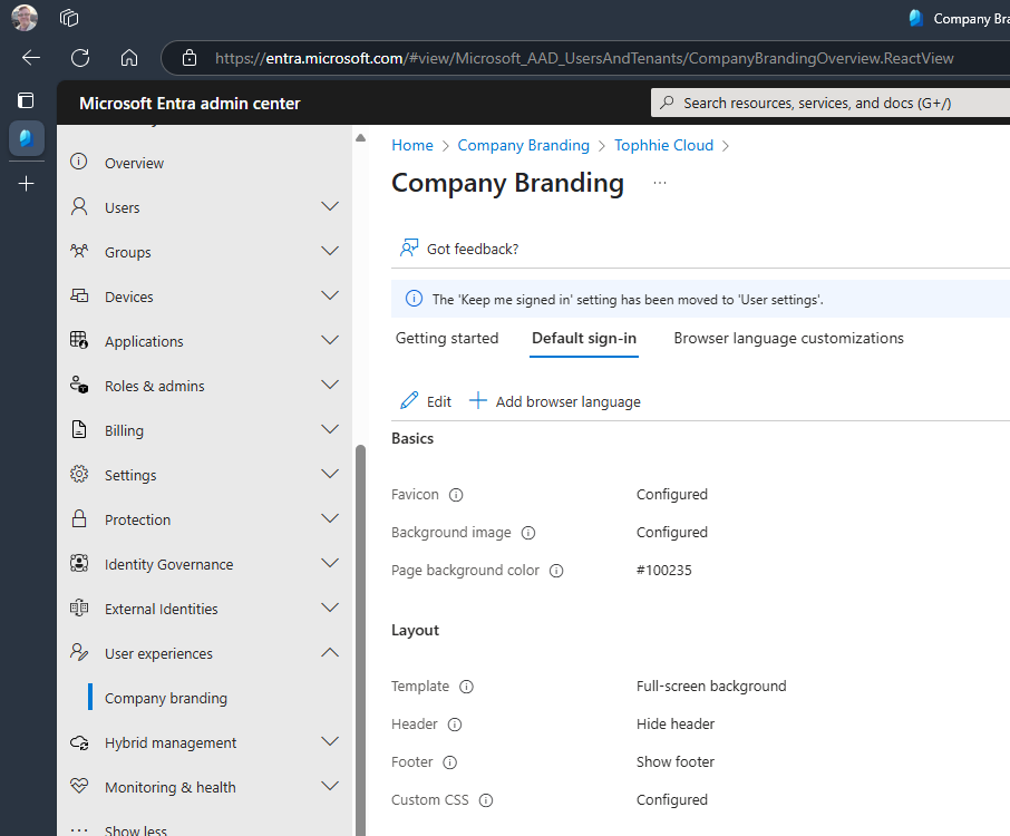
- Head to the Microsoft Entra admin center at entra.microsoft.com.
- Go to Identity > Show More > User experiences > Company branding.
- Go to the "Default sign-in" tab > Click "Edit".
- Go to the Layout tab > upload your Custom CSS file > click "Review + Save".
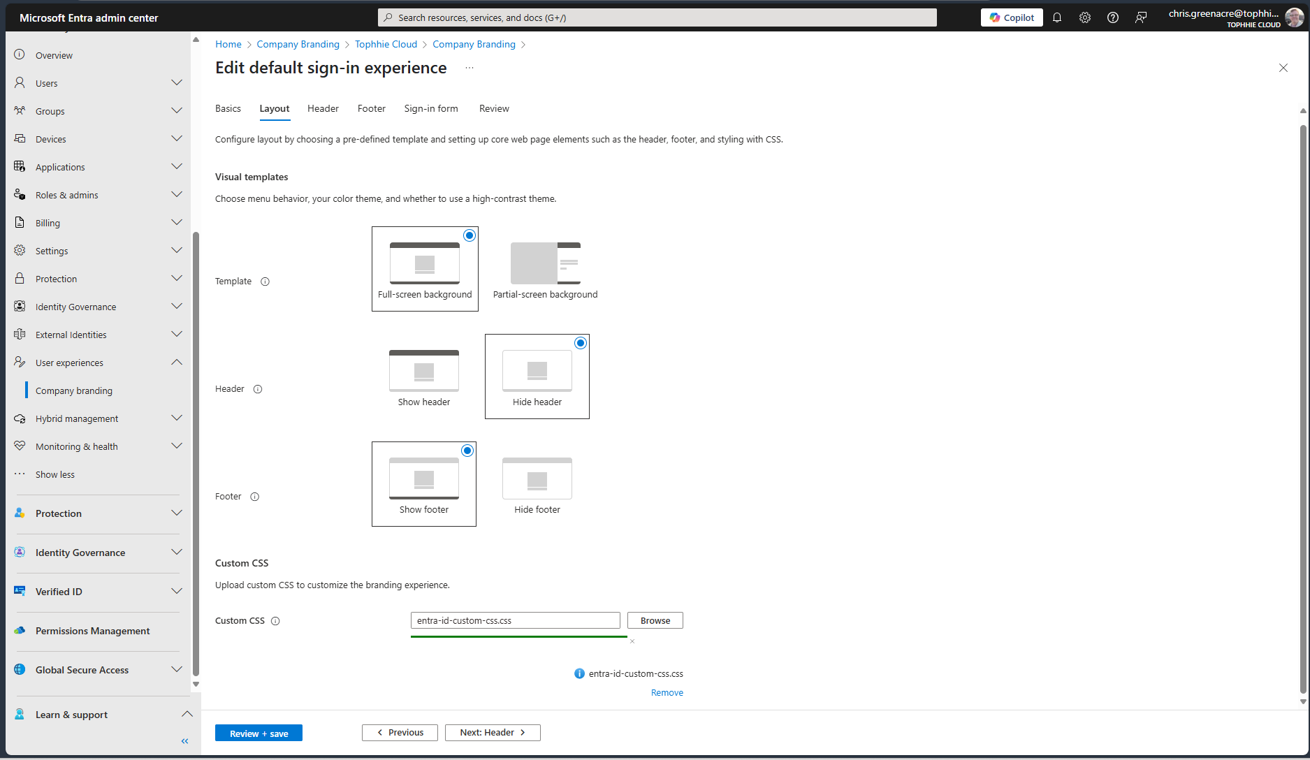
- Click "Save".
- Done!
You should really look into the Entra CSS styling feature. Really level up your identity game.
Until next time 👋


